
The task canvas
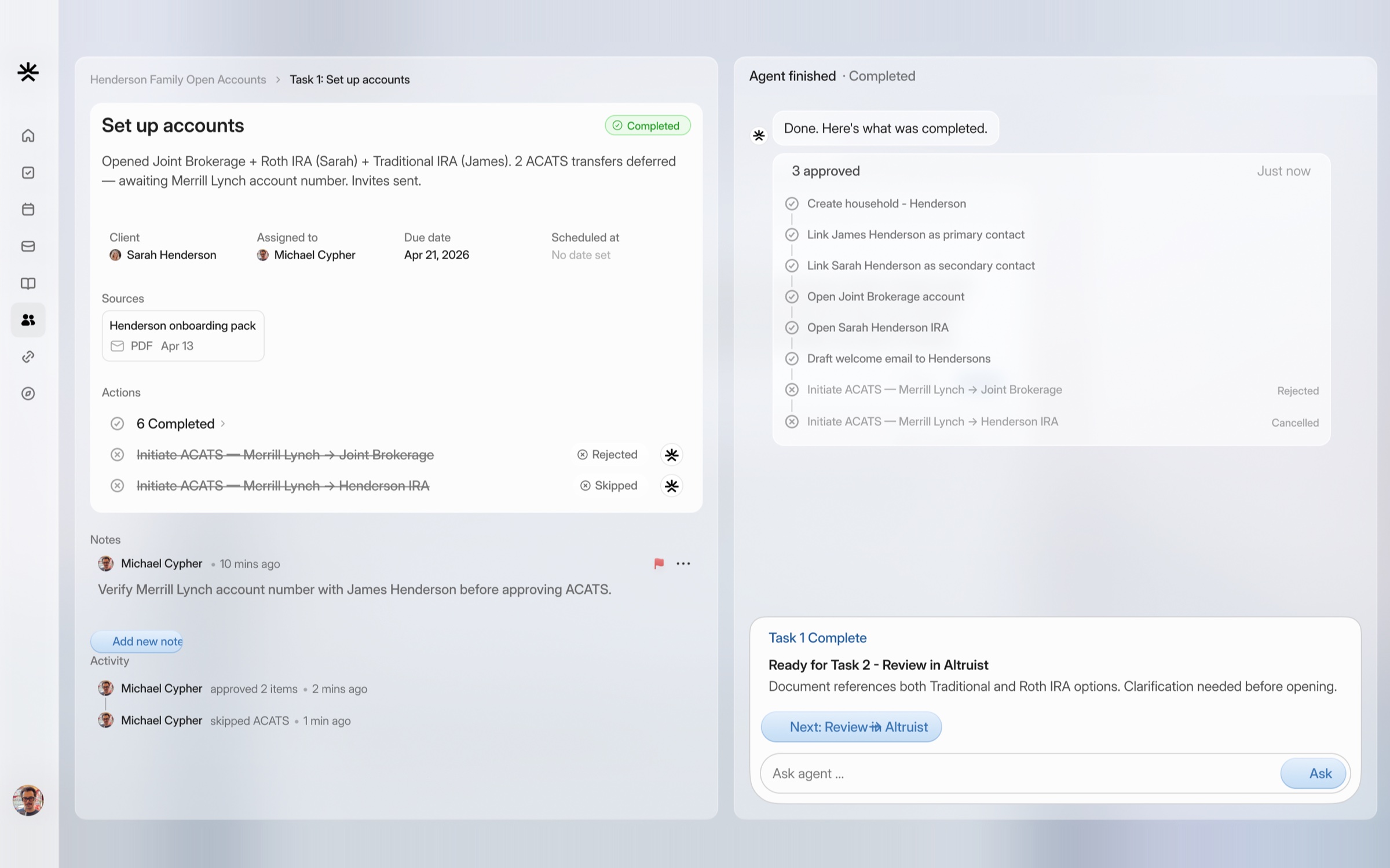
Stacked task cards modeled on iOS notification stacks. Conversation context on the left, interactive components on the right, and auto-advance as each task completes.
We designed the AI wealth platform where agents draft the work and advisors approve it, from the task system to every chart.
Arca is an AI-native platform for financial advisors. Agents process meeting transcripts, draft client emails, create tasks and update records. Advisors review and approve anything sensitive, like a client email or a trade. It connects to the tools advisors already use, from CRMs to custodians.
The team had reached the point where building more without design might go in the wrong direction. Their co-founder called the task system almost the core piece: how advisors see the work assigned to them, and how human-in-the-loop work actually feels. One constraint shaped everything. The agent needs to see everything the user sees, so nothing could hide behind drill-downs or tabs.
Make the evidence visible before asking for trust.
The task canvas
Stacked task cards modeled on iOS notification stacks. Conversation context on the left, interactive components on the right, and auto-advance as each task completes.
Agent action review
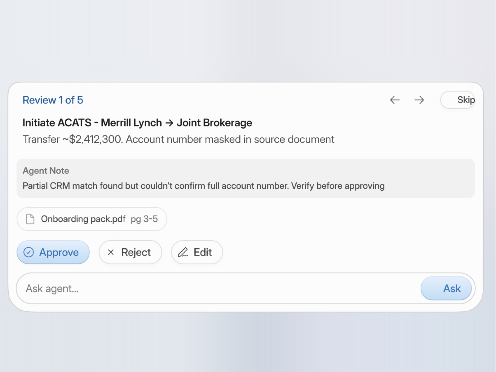
One clear label, Action required or Auto approved, and one review button instead of approving every field. Updates show as before and after.
Citations everywhere
Each suggested field quotes the exact transcript line, email or document passage behind it, highlighted in place.
Diffs for every change
GitHub-style diffs for anything an agent proposes. Old value struck through, new value below.
Navigation the agent can read
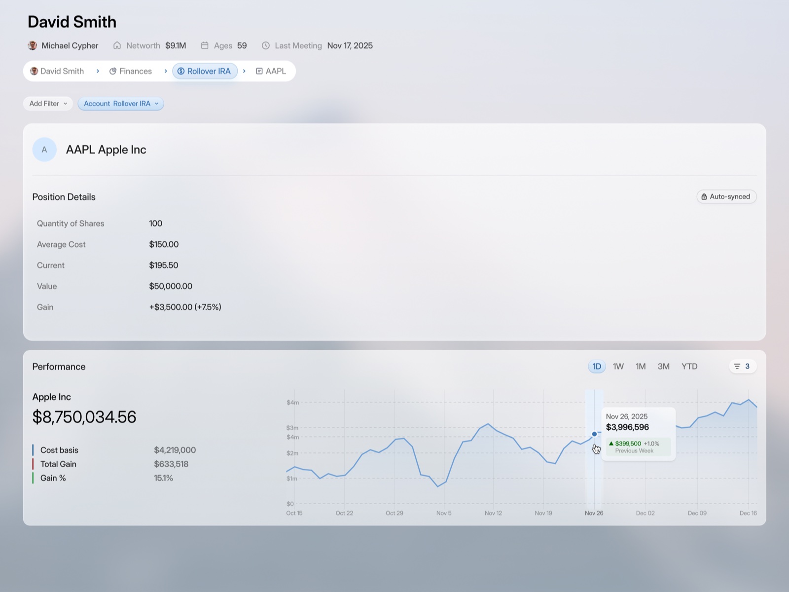
Breadcrumb drill-downs became a flat, dynamic sidebar of intents the agent generates, plus global filters that highlight every component they touch.
Agent chat and workflows
Collapsible thinking blocks, a persistent review chip, stop, queue and interrupt controls, and a split view with stable context beside the agent.
A material system
Frosted glass panels and metallic buttons over day and night gradient landscapes, with exact blur and opacity rules.
The rest of the product
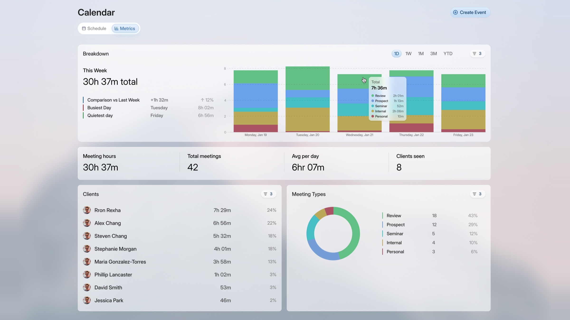
Meetings, inbox, calendar, contacts, a composable chart system, client onboarding, a document vault, mobile, and a full design system exported as variables.
Two reviews a week, then weekly. When advisors started approving in bulk without reading, we redesigned review around fewer, clearer decisions. Ahead of launch the team moved to daily syncs, then we hardened the system: a line-item audit, type cut to a handful of styles, six standard dropdowns, and every radius and color exported as variables. Many components were built straight from our specs.
 Next · AdaptA harness, designed by people who build one.
Building something like this?
Start a project